Lately I've been shown several examples of something that feels particularly trendy in the worst possible way; animated infographics, built using generative AI, that confuse 'complex' with 'informative'. They're often baked into landing pages (also AI-generated) in a section that's buried 3/4 of the way down the page, amongst marketing copy, trying to explain to you how a system works. It's like if a band's show poster just tried to start explaining to you the technical details of the .flac filetype.
It always looks more or less like this example I whipped together. Sometimes, it's worse, with branching arms and a bigger footprint, lots of moving parts that are wildly sized in an inhuman manner.
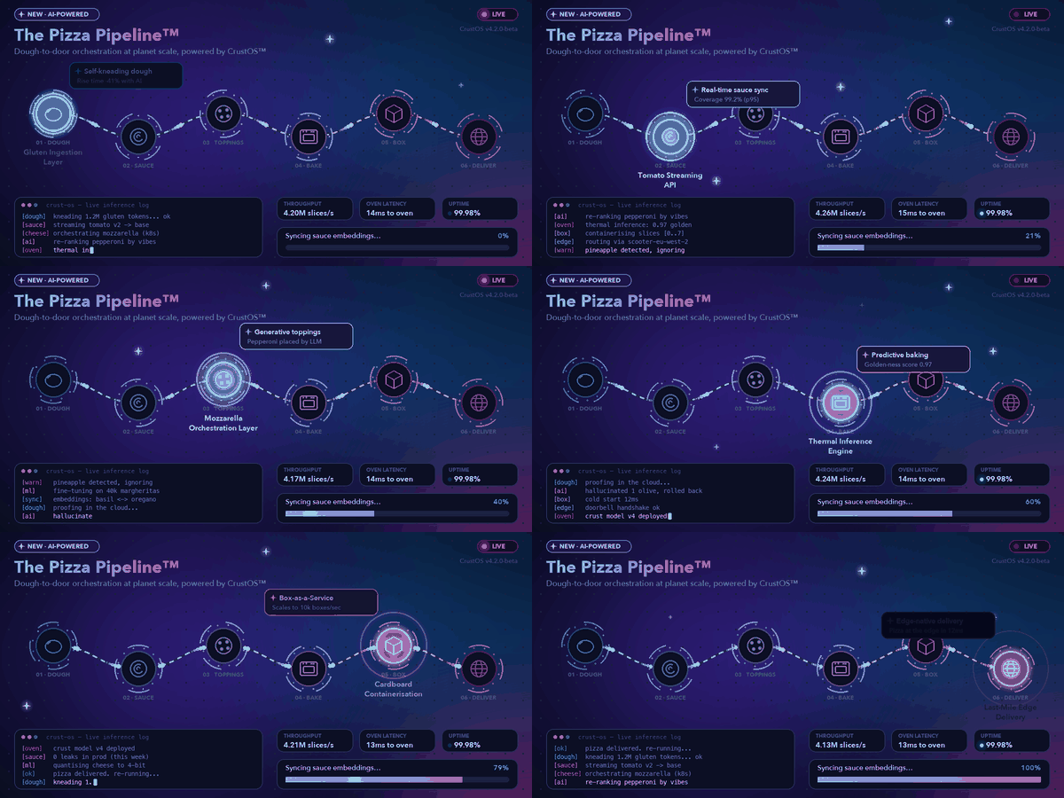
My team knows that if they want to get me ranting, all they have to do is show me a poorly designed infographic. There's something about a well-considered piece of visual information that feels kind to me, and I hold that the inverse (a badly considered one) feels like weaponised indifference. Such an opportunity wasted, to get everyone on the same page only to falter because of a lack of patience in considering how something can be best presented.
I'm so focused on this that I have designed multiple style guides and AI-enabled systems to try to raise the quality bar, both for myself and anyone I work with who cares.
Here's my main appeal -- information shouldn't move unless it absolutely has to. If for some reason it must, then at least give me controls so I can learn it at my own pace.
Little bit out of left field, but I'm going to bring up Jackie Chan. His early Hong Kong produced work used this editing trick where they show the wind-up to the punch just up to the point of impact, and then in the next cut, they jump slightly backwards a few frames to help your brain re-contextualise what you're seeing, so the point of impact feels much harder. Your mind makes a 'whoompf... WHOOMPF' effect and you don't even notice it, which is what any good learning should aim towards.
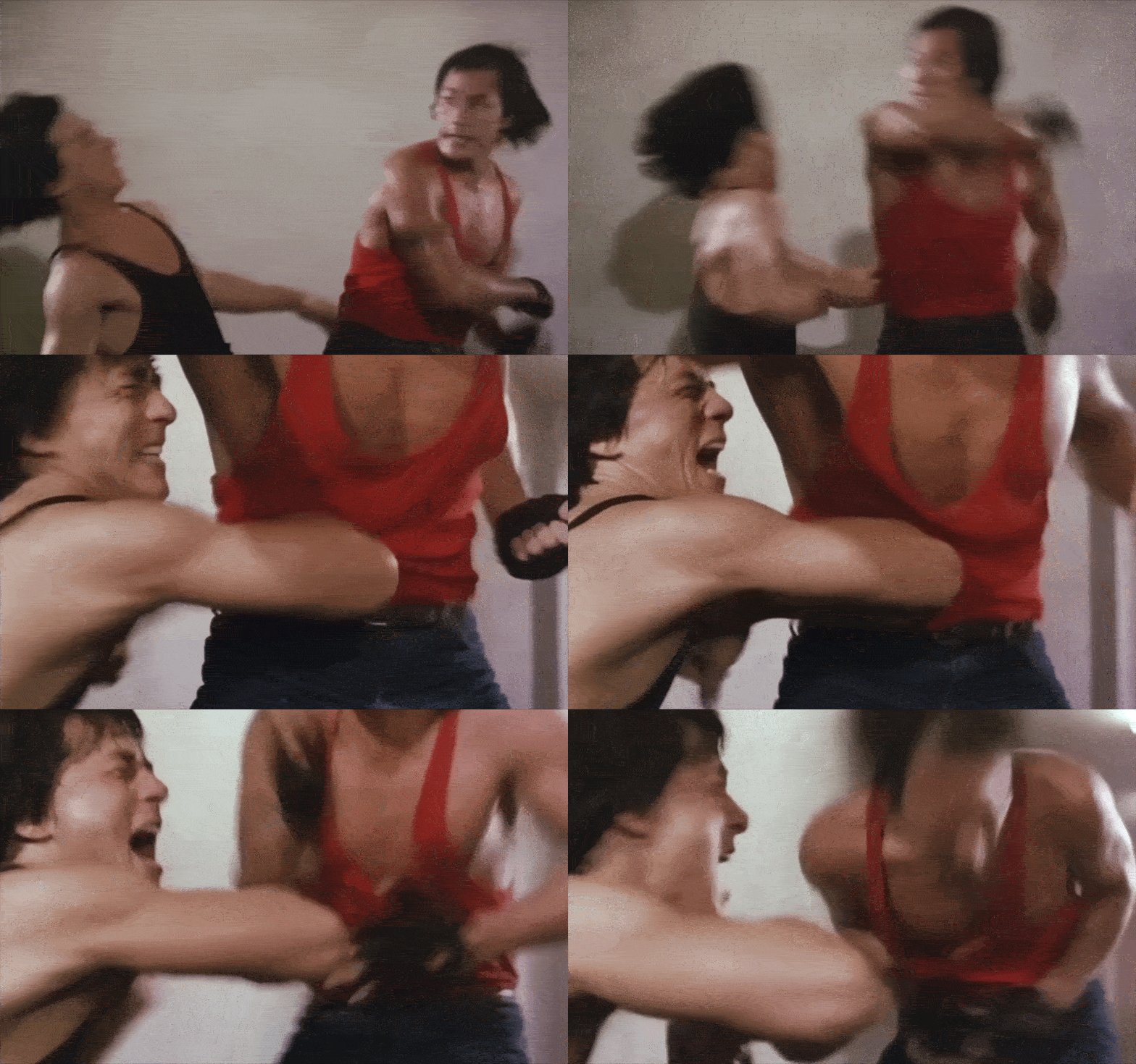
Connecting this to information design feels like a short leap. We're talking about deliberately slowing down a process, and choosing to design for maximum understanding, as opposed to prioritising presentation.
Speaking of maximum understanding, it's always a good idea to take the approach of slow-walking a visual piece of information; explain what you're about to show, what you're showing, what you've just shown. Especially if this is all brand-new information for someone else, this kind of repetition is incredibly useful to help get their feet under themselves. Anything that comes afterwards, especially if it builds on top of that information, will feel much more solid if they've fully grasped what they've seen.
There are also practical reasons why information is best served static:
- Like it or not, the world still essentially runs on email. Can what you're designing be opened in Outlook? We must still design things that look good on the worst software, or even printed on a physical page. (It still happens!)
- Also like it or not, LLMs are sticking around, and a static image is a lot easier for a model to parse than an animation. If your goal is to share good context, then AI models should be considered as a necessary part of the chain of information.
- Not everyone learns the same way. Attention spans are different, comprehension takes time and we enforce ADA standards on the web for a reason. Infographics and diagrams shouldn't be fully exempt from those generosities.